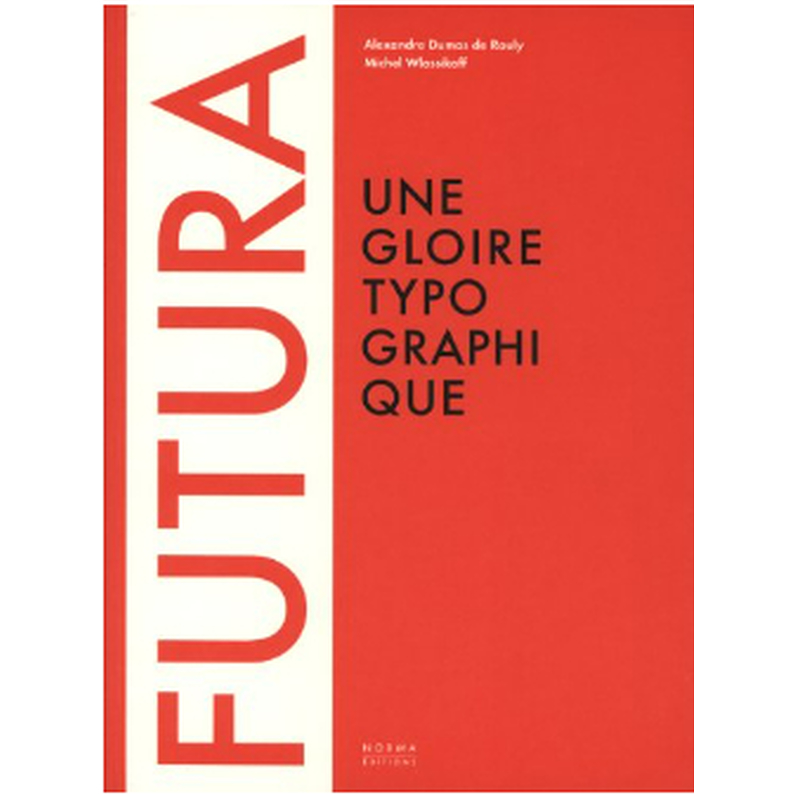
Characteristics
- Number of pages
- 192
- Dimensions
- 10.79x8.27x0.71
- Categories
- Bookshop, Graphic design and ads, Exhibition, Exhibition - Étienne + Robial.
Description
Created by the German painter and typographer Paul Renner, Futura enjoyed unprecedented commercial success upon its publication in 1927. Its rigorous construction and functional design consecrated the principles of modernism in the field of typography. Jan Tschichold, Kurt Schwitters, Piet Zwart used it widely during the 1930s. Distributed under the name "Europe" in France by the Deberny & Peignot foundry, it inspired Cassandre in his search for a new writing style.
In the United States, where modernity found refuge at the end of the 1930s, Ladislav Sutnar, Bradbury Thompson or Paul Rand popularized it during the Second World War and in the 1950s. Volkswagen used it for its unusual campaigns at the turn of the 1960s, and its adoption by NASA for the Apollo 11 lunar mission made it the type of space adventure.
This astonishing evolution did not escape Stanley Kubrick in his vision of 2001: A Space Odyssey, and he became fascinated by this alphabet, using it in several credits and communication elements of his films.
Barbara Kruger makes it enter the register of the contestation and the detour in the years 1980, while the extension of the field of its use is revealed, for example, on the screens of Canal+.
Futura is a major reference for type designers and graphic artists. Herb Lubalin, Adrian Frutiger, Erik Spiekermann and Christian Schwartz have used its forms for original alphabets or interpretations. Through more than four hundred rare and often unpublished documents, this book traces the history and the most interesting uses of Futura and plunges us into the world of the letter by revealing its cultural and social stakes.

